
Portfolio
As a multidisciplinary artist, I work a variety of media. My fine art uses ink, paint, canvas, and paper; as well as graphite (black and white, and colour). For digital art, I primarily work in composite, collage, and book design.
For the viewer’s convenience, core work is listed here on a single page.
Updated: October 2021
Table of Contents
Book Design
As a book designer, I love to use interior formatting to fit the author’s needs. Primarily, my clients are self-published authors who use Kindle Direct Publishing (KDP) to publish their paperback books. I use InDesign and styles crafted for each book to reduce rivers, widows, and orphans to create readable pages.
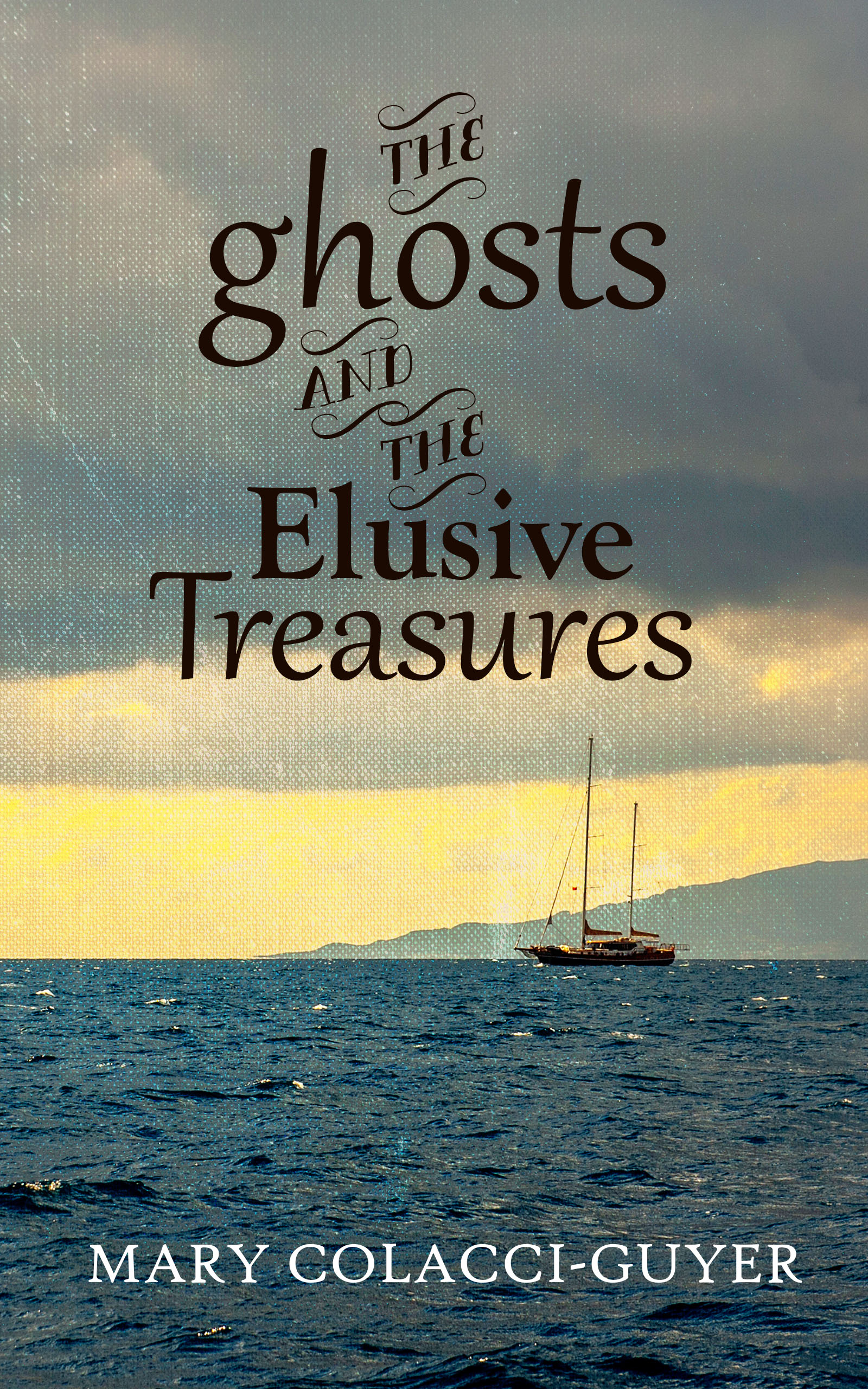
The Ghosts and the Elusive Treasures – Cover, Interior, and Ebook
Timeline: February to May 2020
Tools: InDesign, Photoshop
Mary Colacci-Guyer approached me to conduct two phases of her self-published adventure-romance novel The Ghosts and the Elusive Treasures: line editing and all formatting. Learning from my previous projects with Briana Morgan and JB Jefferson, we completed line edits in December 2019 before beginning typesetting, as Mary suggested doing both at the same time. Mary had a general guideline for art direction while I supplied ideas. Initially, I was brought on to provide typography for a cover illustration supplied by the author, but unfortunately the image resolution was too small for print. Mary chose to use a photograph and typography after seeing the mockup I created using the illustration. This setback was corrected when I licensed a photograph through iStockPhoto to create a wraparound back and front cover, and used similar typography to the “On Wings of Faith, Hope & Love” cover at Mary’s request.
Mary’s chapter headings included epigraphs, which was a new formatting element for me to work with. We used italics for Italian language throughout. The manuscript included telegrams, which were styled using monospace font. As a subtle nod to the “Treasures” in the book, I used a diamond glyph to note sections in the book. The ebook was built using HTML formatting and then compiled into a MOBI file for KDP through KindleGen/command lines.


Web of Deceit (Book 1 and Book 2) – Ebook Design
Timeline: June to September 2019
Tools: Notepad++, KindleGen
JB Jefferson contacted me to provide ebook services for his erotic mystery series, Web of Deceit book 1 and book 2, to be self-published through KDP. Using Kindlegen and HTML, I provided files quickly. Using HTML and a command line to convert ebooks to MOBI for Amazon ensured that files were clear of clutter and, most importantly, reflowable. One challenge for this project was the number of updates done to the manuscript, as editing and ebook formatting were conducted simultaneously. As the ebook files were reflowable and highly flexible, it was quite easy to complete the corrections using search and replace functions. Instead, this challenge came about because of the relationship between the stages of editing and designing during book production. Each edit required updates to the files, which I felt slowed down overall production time from edits to publication, though JB reassured me the timeline was appropriate for his publication goals.
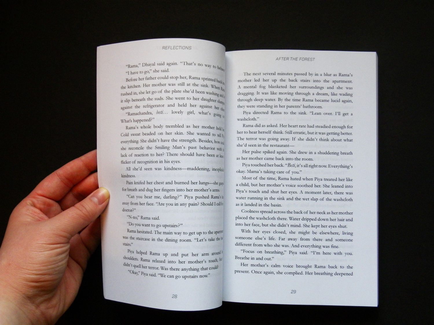
Reflections – Interior
Timeline: May 2017; June 2019
Tools: InDesign, Photoshop, Pencil & Paper
Briana and I worked on her second novel Reflections, a YA fantasy, for many months first with editing (developmental to line editing) and then with interior design. This project included a table of contents and a hand-drawn illustration for chapter headings, which I completed using pencil and paper and then edited in Photoshop. Briana wanted the general feel of the text to be airy and open. Typography for chapter headings and running headers coordinated with the 1st edition cover by using the same font face. Working on a manuscript from edits to design was a real treat, as I was intimately familiar with the words. However, it did lead to a challenge when proofreading; due to our familiarity with the content and the appearance of the text, Briana and I did extra passes proofreading to make sure the novel was ready. Reflections was re-released in 2019 with a new cover, additional proofreading, and my original formatting. In the future, I would have aimed to create a vector illustration instead of a raster image to make it easier to fit on the page.


Blood and Water – Interior
Timeline: February 2017; June 2019
Tools: InDesign
Briana Morgan approached me to do the interior layout for the 2nd edition (2017) and 3rd edition (2019) of Blood and Water. Briana and I coordinated the interior typesetting for the two re-releases of her first novel, a YA post-apocalyptic sci-fi. Chapter heading design focused on motifs from the 1st edition cover design by using the same font face and including a strong graphic brush stroke. Briana desired flow as the main focus of the text. Typesetting challenges for this book included a large number of rivers, orphans, and widows (particularly at chapter endings). The author’s preference to omit running headers ensured that the book stayed within a page count goal, as the page count affected the budget for printing and list price. The design again followed KDP guidelines. Briana approached me in 2019 for the 3rd edition re-release, where I proofread and completed minor edits (names, websites, spelling, punctuation), using the original formatting from 2017.


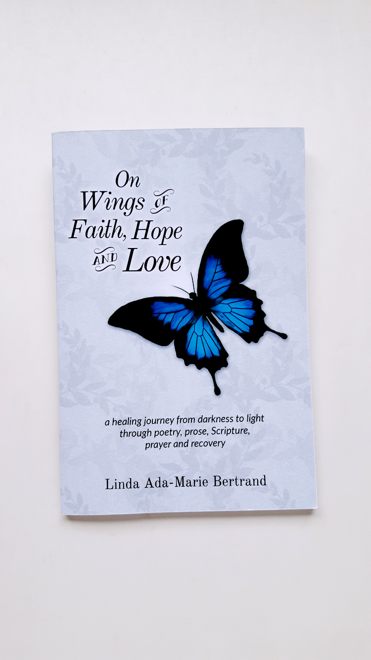
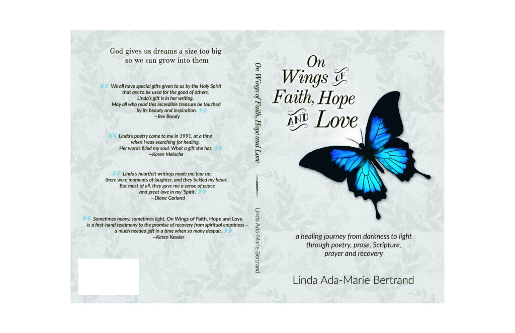
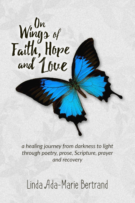
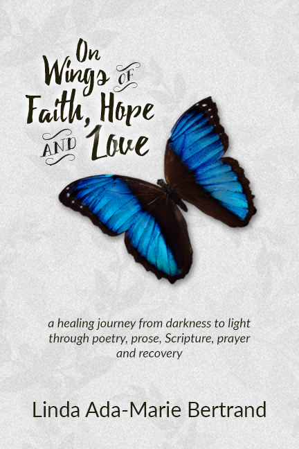
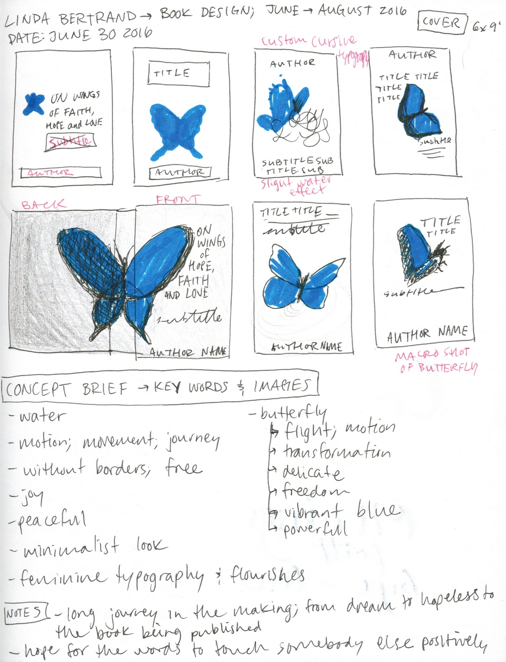
On Wings of Hope, Faith & Love – Cover and Interior
Timeline: June to August, 2016
Tools: Photoshop, InDesign
Linda Bertrand approached me to complete the cover design and interior layout for her poetry and short prose collection On Wings of Faith, Hope & Love. Using Photoshop for the cover, including stock photo assets, digital drawing, and font licensing, I created a cover that met Linda’s strong visual direction. The interior was designed using InDesign. Linda requested a larger font and strong glyphs throughout the design to improve readability for her target audience of seniors. Design challenges for this book included the thin text block size, leading to compromises on the spine design; meeting the design guidelines for the Xpress Publishing Lab offered through the Windsor Public Library; and reducing widows and orphans between pieces, as there were over 100 poems and short prose pieces. In December 2016, Linda returned to me for a few tweaks for the 2nd edition.


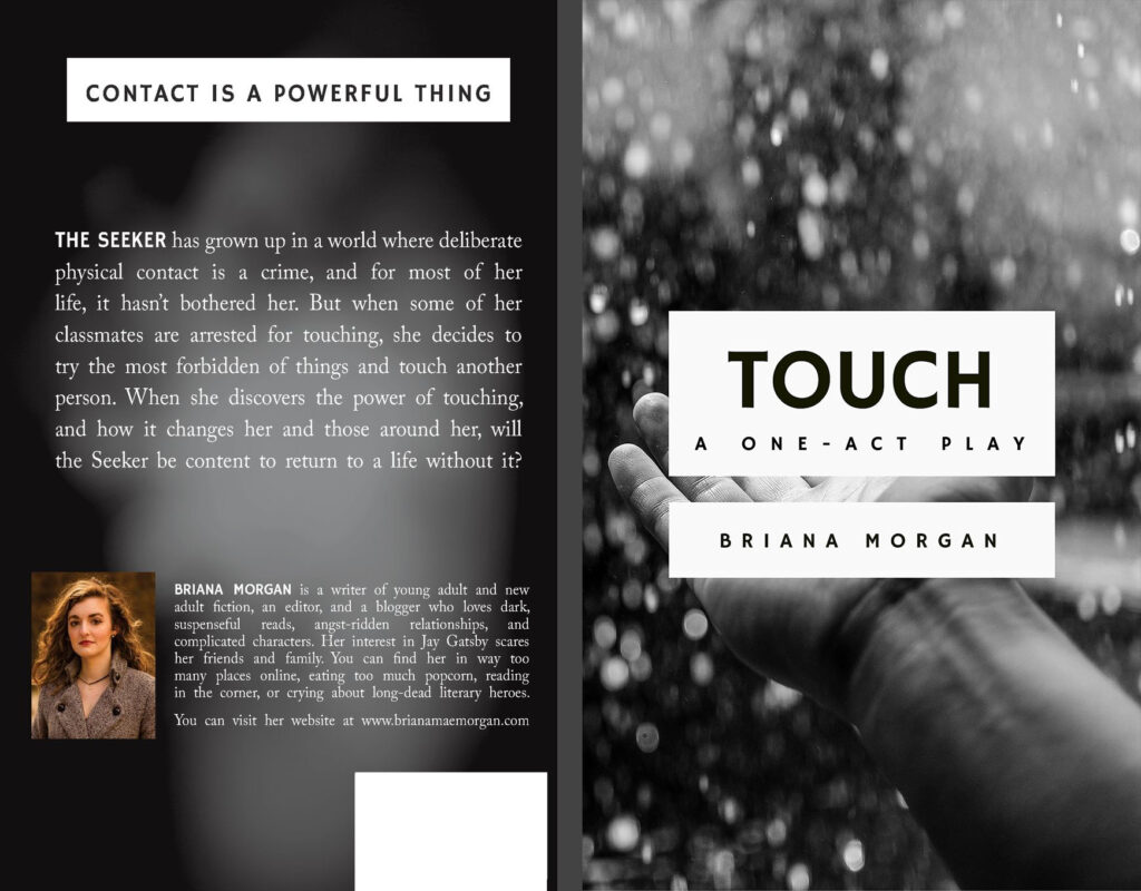
Touch – Cover
Timeline: April 2016
Tools: InDesign
I approached Briana Morgan to do the back and front cover of the paperback edition of Touch: A One-Act Play (Amazon). This project had a quick turnaround time and Briana brought the overall design and photograph asset to me. This quick project focused on adding text to the front and back covers alongside the creation of a PDF for use on KDP. The main design challenge for this project was that I wasn’t confident yet with Photoshop, and so I used InDesign to help me with the margins for setting up the full cover for KDP’s requirements.
Mock Book Covers
In 2017, I designed mock book covers for three stories I knew very well: The Bad Beginning by Lemony Snicket; Livingston Girls by Briana Morgan; and The Thief Lord by Cornelia Funke. My goal was to create a cover very distinct from the original using a variety of trends and styles.
The Bad Beginning – Genre Swap
My goal for this mock cover was to change the genre from a children’s dark comedy to an adult literary fiction or YA contemporary style. I used one photograph and Photoshop effects, such as using an Action for the fire effect, to integrate text into a simple picture, focusing on the typography and use of space.

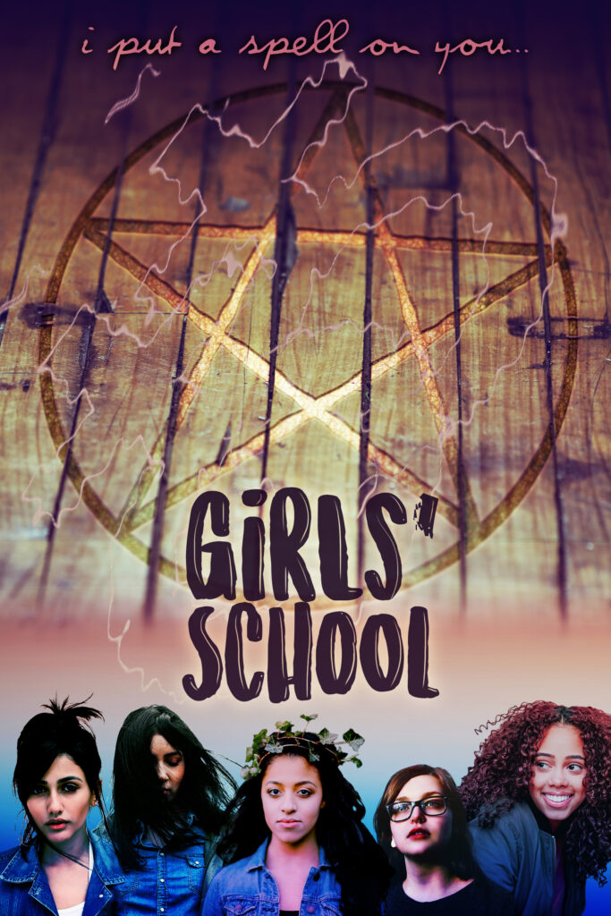
Girls’ School – Movie Tie-In
The mock cover for this title used the working title of the book (“Girls’ School”) with the idea that there had been a movie adaptation. I drew inspiration from song lyrics for “I Put a Spell on You” (nodding to the Hocus Pocus film) and used . A subtle lesbian symbol nods to the queer characters. Photoshop was used heavily for colour toning, the pentagram symbol, and cutting the models out of their original backgrounds.
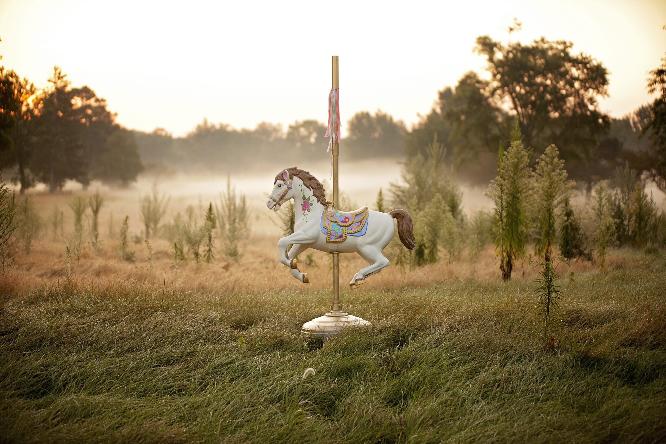
The Thief Lord – Trend Redesign
For The Thief Lord, my goal was to change the feel of when this book was published; it was originally published in 2000 with an illustration by Christian Birmingham, and I wanted to bring it to the YA fantasy trends of 2008-2012. This style visually focused on a symbol or scene from the story. Inspiration was from:
- Cinda Williams Chima’s series “The Heir Chronicles” (2006-2014) and “The Seven Realms” (2009-2012)
- Maggie Stiefvater’s The Raven Boys (2012)
- Cassandra Clare’s City of Bones (2007) and City of Ashes (2008)
This cover used a large amount of compositing in Photoshop to create the landscape and focus on the symbol of the story’s rumoured magical merry-go-round.

Below are the source images I used and edited to create the mock cover.


Photography
As a photographer, I value natural light, balance (symmetrical and asymmetrical) and interesting composition.
“Architecture Above” Series
2018 – present
The feats of engineering that go into the power grid astound me. These monstrous metal things, criss-crossing our landscape, carry enough power to kill us tenfold. In this series, I focus on composition, contrast, and line to abstract the massive frames of powerlines against an overcast sky. The viewer’s perspective is warped further by the camera’s positioning: rather than against the horizon, we are underneath and looking up.
The first three photos in the series won “Best in Show – Photography” at the student year-end art exhibit hosted by Whitby Station Gallery for Durham College’s annual Juried Art Show in 2019.


Pet Photography


Miscellaneous

